SOCIAL ORGANIZER
A decentralized mutual-aid platform — real product, working Telegram bots, open code — with one structural flaw: nobody understood it unless the founder explained it in person. This is how the product learned to explain itself.
A civic product that only existed when the founder was in the room
EXODUS — the project's original name — was a working platform for decentralized mutual funds: communities pooling small contributions so help is there when one member needs it. Telegram bots worked, the platform had open code and an API. But the concept — smart-contract logic, reputation instead of a treasury, self-organization — didn't survive a paragraph. People nodded through the founder's live pitch and couldn't retell it afterwards.
Why the existing communication failed: it described what the product was (a decentralized mutual fund) before the audience understood what it was for (turning your connections into real care). For a public initiative that depends on participation, that's fatal — you can't onboard a movement one live pitch at a time.
Understanding depended on one person
- Every new participant, partner, and contributor needed the founder's 15-minute walkthrough
- The site led with mechanics — mutual insurance history, decentralization theory
- Each deck and page explained the product differently
- Interest arrived; participation stalled at "I'll wait for a proper demo"
Understanding built into every surface
- One human message first: "A small effort from many, enough for one"
- The site walks the founder's best pitch — value, then mechanics, then proof
- Motion carries the concepts that died as text
- A stranger can land, understand, retell — and join without meeting anyone
The founder's pitch was the spec
I treated the founder's live presentation as source material: what he always said first, where listeners nodded, where they got lost. The old site, decks, and real conversations were audited against one question — at which sentence does comprehension break?
People didn't fail to understand the product. They failed to understand it in the order it was presented. The fix was sequencing and translation — theory into human language — not simplification.
One compact system: logo, type, color, grid, UI, motion
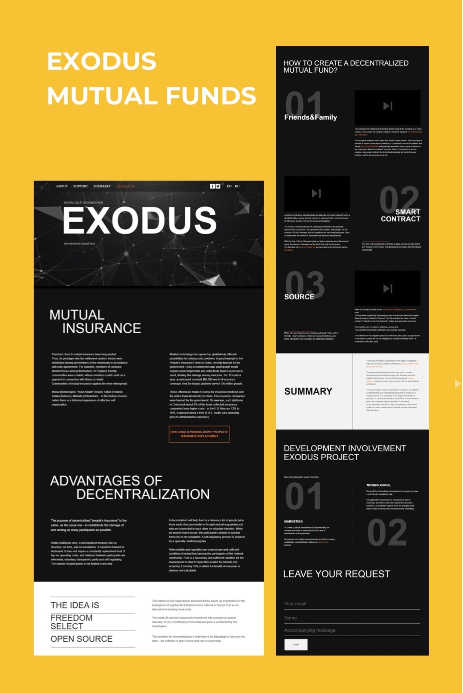
Black ground, a single warm orange, confident geometric type, and a particle-network motif — connection made visible. The system had one job: make an abstract idea feel human and trustworthy at every touchpoint.
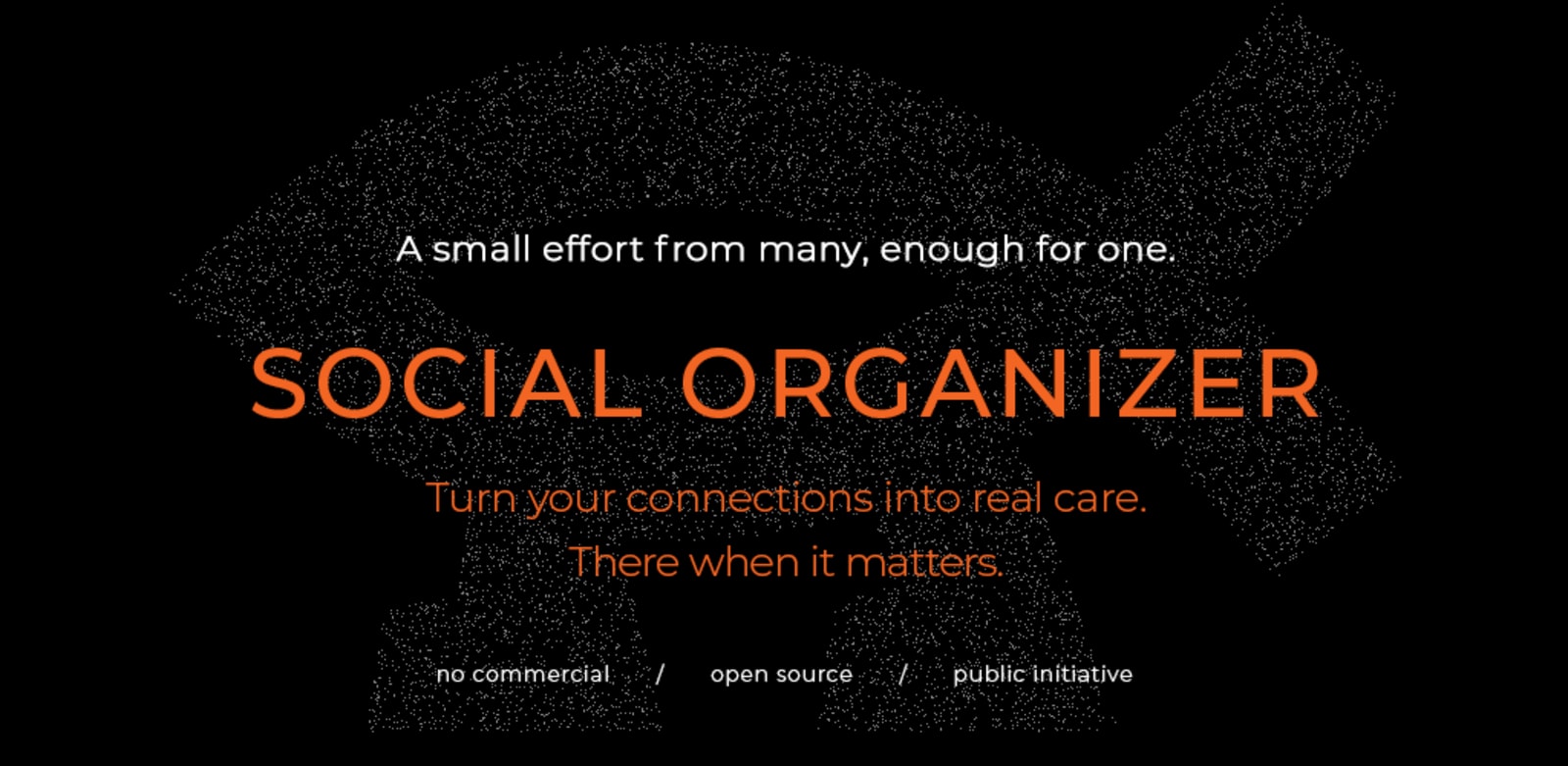
- Dark ground + one orange accent — seriousness of purpose, warmth of intent
- Confident display type — a civic initiative that believes in itself, no decoration
- Network motif — many small contributions forming one act of care
- Three honest labels — no commercial / open source / public initiative — trust stated up front
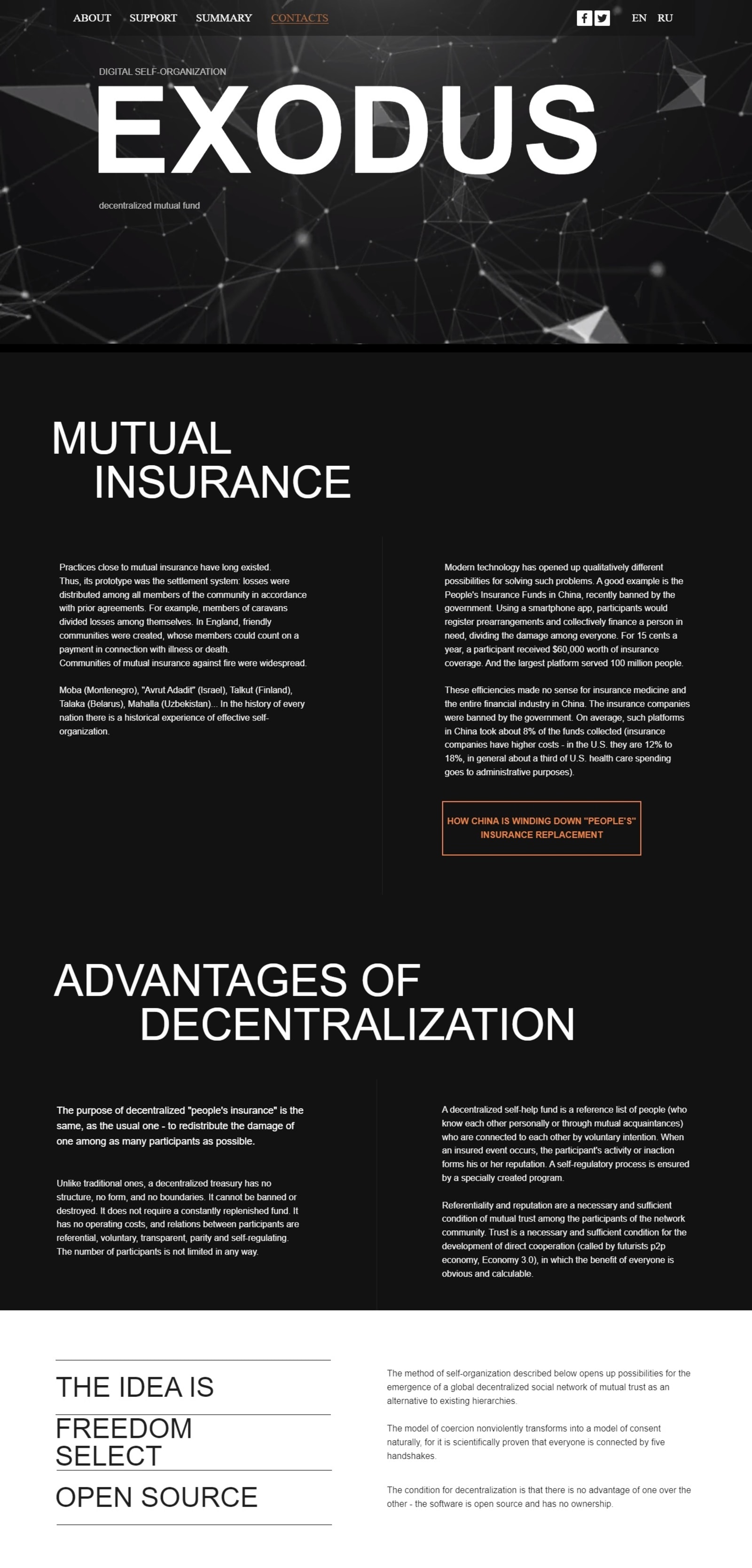
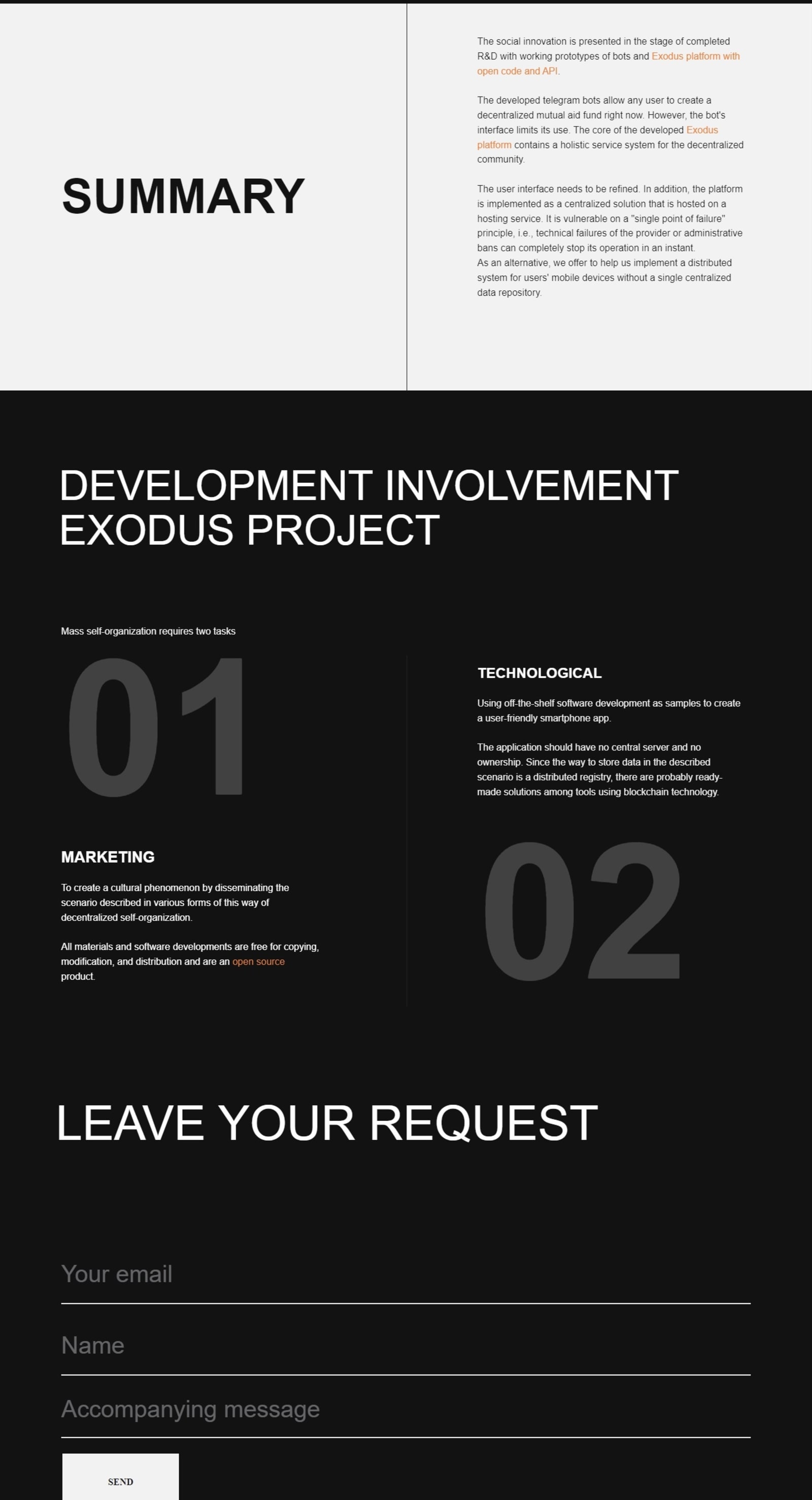
The site walks the pitch, screen by screen
Value
"Turn your connections into real care" — before any theory
Context
Mutual insurance has always existed — this makes it work digitally
How it works
Friends & Family → Smart Contract → Source — one video per step
Proof
Working bots, open code, R&D summary — the product is real
Join
Two involvement tracks (marketing, technological) + request form
Proof sits exactly where the live pitch used to get its hardest questions — not at the end, where scepticism has already won.
A longread that carries the whole argument
Moving the explanation out of the founder's head
Founder
The only working explanation — a live, adaptive 15-minute pitch
Message
"A small effort from many, enough for one" — theory translated into one human sentence
Brand
Identity and tone that make an abstract idea feel trustworthy
Website
Architecture that walks the pitch: value → mechanics → proof → join
Motion
Animated explanations for the concepts that failed as text
User → Understanding
A visitor can retell the product — and join — without ever meeting the founder
Where words failed, motion carried the concept
The three hardest ideas — how a trust circle forms, how the smart contract holds it together, how an insured event resolves — each got a short video on the site's "How to create a decentralized mutual fund?" section. Every animation answered one specific question that stalled real conversations.
Motion wasn't decoration — it was the load-bearing explanation layer, reused across the site, decks, and social. [ADD 2–3 motion frames / video embed via Vimeo]
From EXODUS to SOCIAL ORGANIZER
The mature product kept the system — black ground, orange accent, confident type — and matured the message. "Decentralized mutual fund" became "turn your connections into real care." Same truth, human order.
- Name change — from a codename to a plain description of what it does
- Lead with care, not mechanism — decentralization became the how, not the headline
- System kept — color, type, and tone stay recognizable across both stages
The product could finally explain itself
Social Organizer became communicable digitally, at scale: the website, motion, and brand now do what previously required the founder's personal presentation. Communication stopped being the bottleneck for a project whose entire model depends on people understanding it enough to join. The product launched publicly.
"The test was simple: could a stranger land on the site and explain the product back to us? After the rebuild — yes."
A non-commercial public initiative publishes no conversion metrics — the outcome is stated qualitatively and verifiably.
Why it was built this way
Narrative re-sequenced: value before mechanism
ReasonThe founder's mental model (how it works) did not match the visitor's (what it does for me). The site now follows the visitor's order.
Motion introduced as the explanation layer
ReasonTrust circles and smart-contract logic killed conversations as paragraphs. Animation communicated in seconds what static text couldn't.
Confident display typography
ReasonA civic initiative asking for participation needs conviction, not decoration. The type asserts; the copy explains.
Rename and reframe at maturity
ReasonEXODUS described a codename; Social Organizer describes a purpose. The visual system stayed — recognition survived the sharper message.
Related: Creative Agency — the same founder-dependence problem, commercial context.