MONE → MIO
Rebranding a working restaurant — with guests, staff, and revenue on the line — into the Italian bistro Mio. Not a logo refresh: a repositioning with three identity directions, each argued in business terms, and a system the team can run without a designer.
Rebranding a business that can't close for renovation
A startup gets to invent itself. A working restaurant doesn't — it has regulars, reviews, a feed, and staff who need to apply the brand tomorrow morning. The repositioning to Mio — Italian Bistro had to signal a new level of cuisine and atmosphere while staying operable by the team from day one.
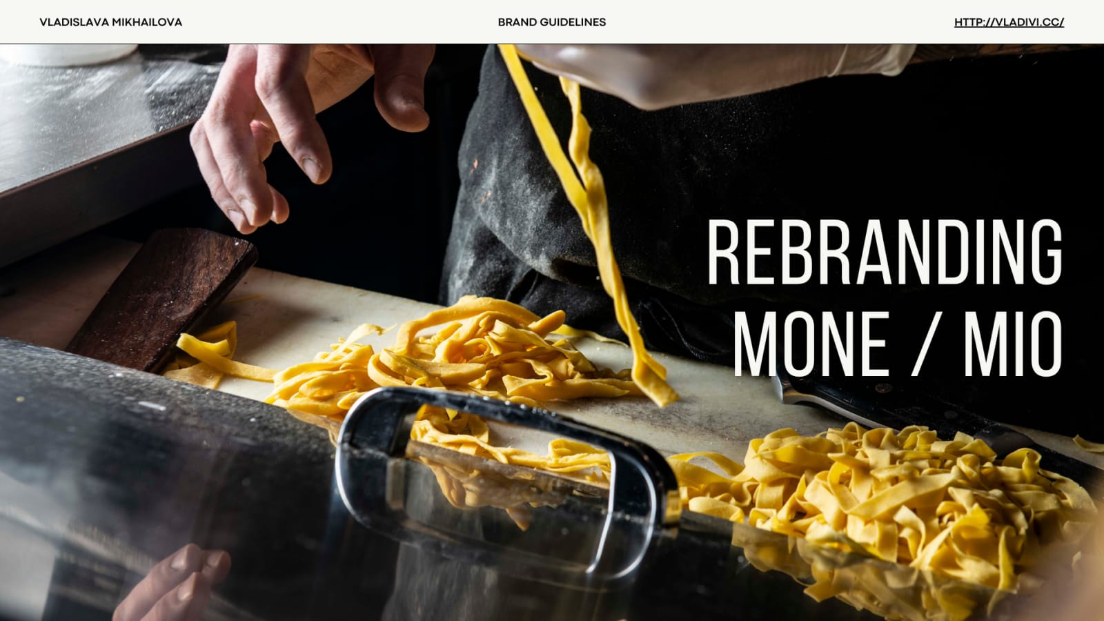
Three directions, three business positions
Instead of one "designer's choice," the client received three coherent identities — each a different positioning decision, argued in writing: what it signals, whom it attracts, how it behaves on menus, signage, and the feed.

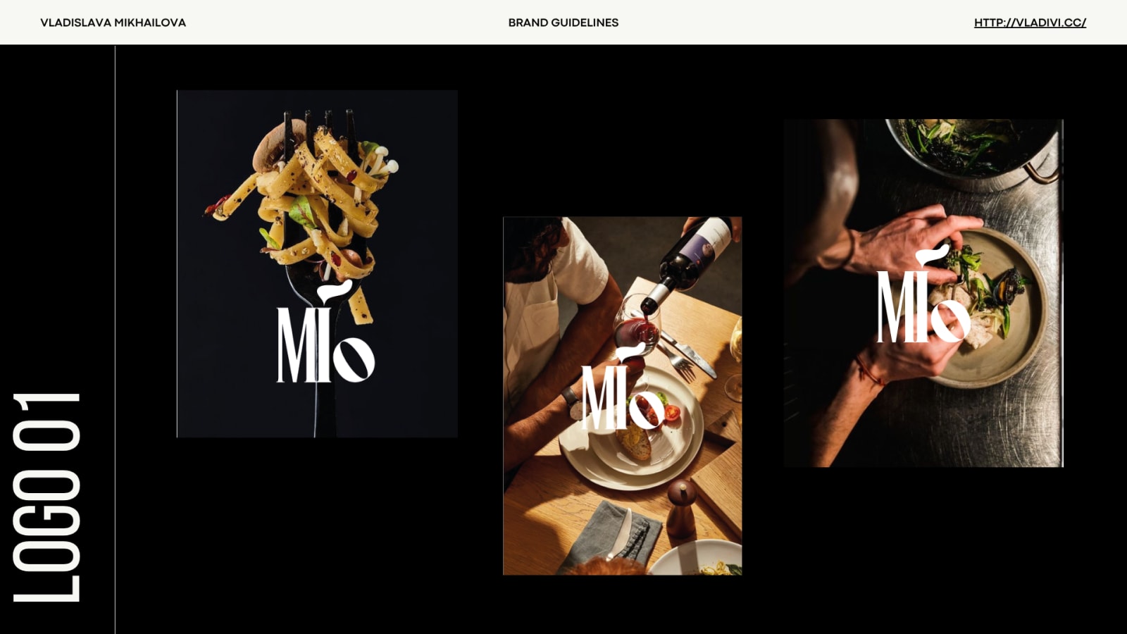
01 — Refinement & Craft
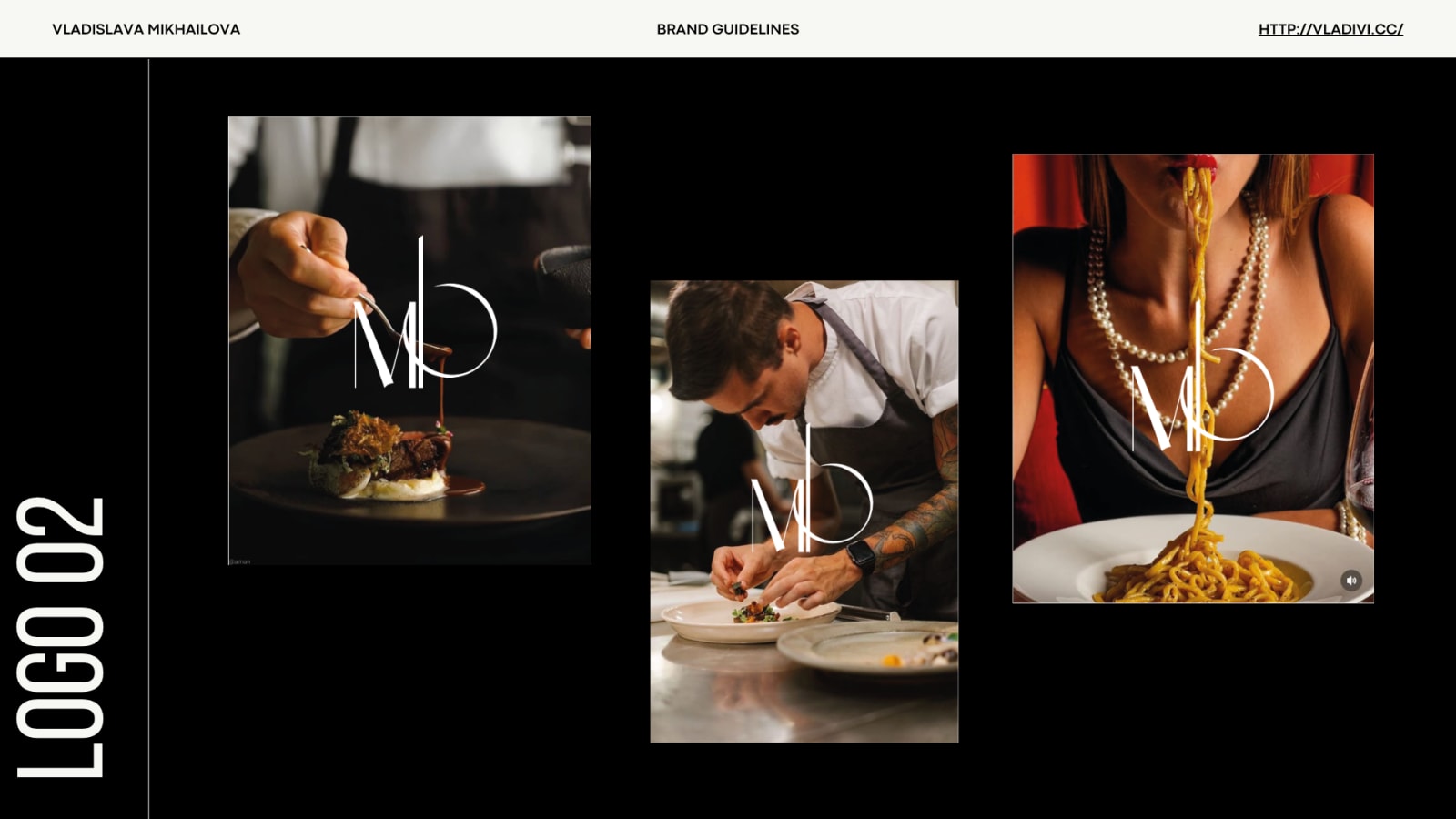
Classic serif with an organic brush-stroke "i" — hand-made warmth, attention to detail, a place valued for atmosphere as much as taste.
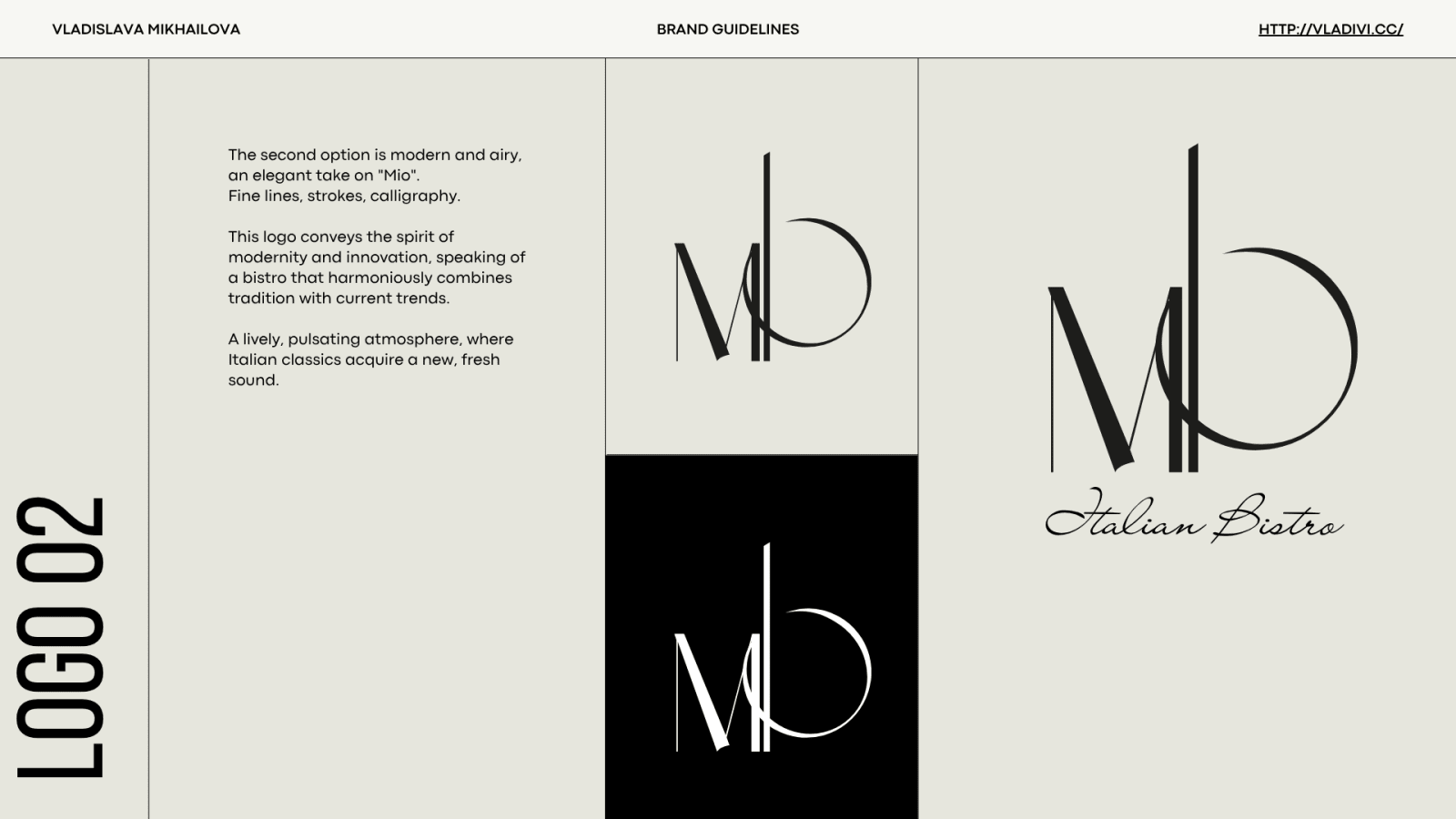
02 — Modern & Airy
Fine lines and calligraphy — tradition meeting current trends; a lively bistro where Italian classics get a fresh sound.
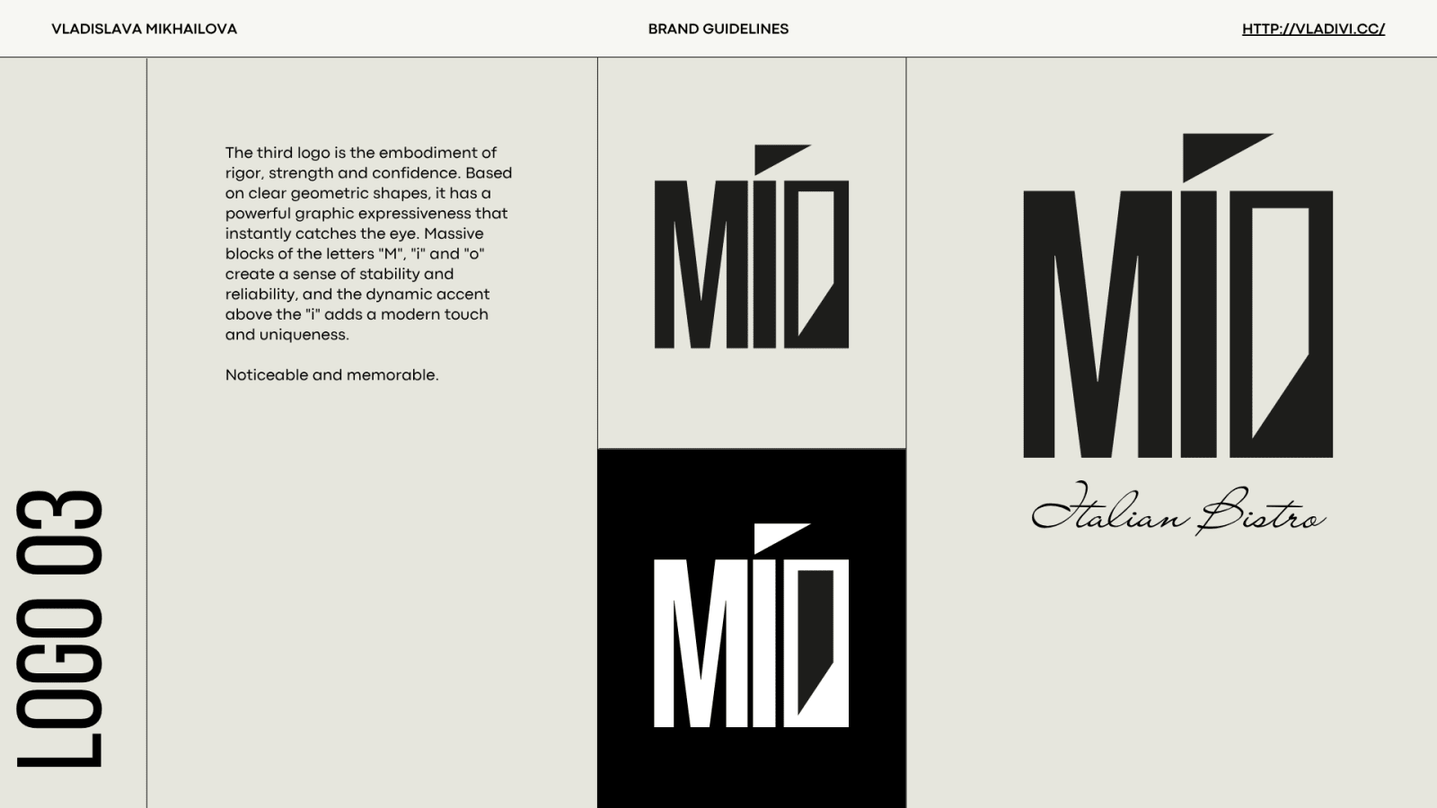
03 — Strength & Confidence
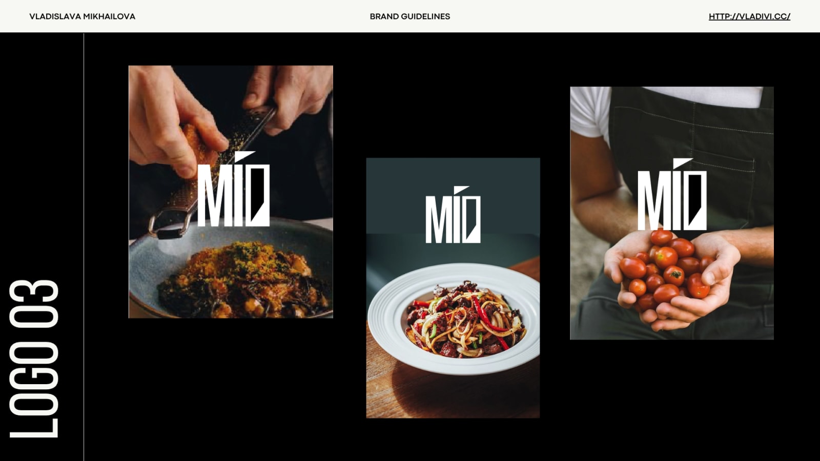
Massive geometric letterblocks — stability, reliability, instant recognition across signage and social.
The identity choice is a positioning choice — it belongs to the business owner. My job was to make each option honest, complete, and consequence-labeled.
Every direction proven on real surfaces
Color and type built for menus, signage, and the feed
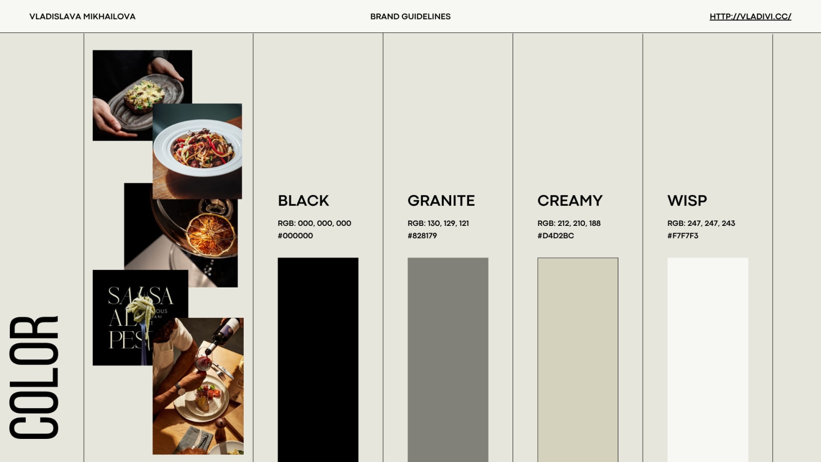
- Black · Granite · Creamy · Wisp — restraint that lets food photography carry the appetite
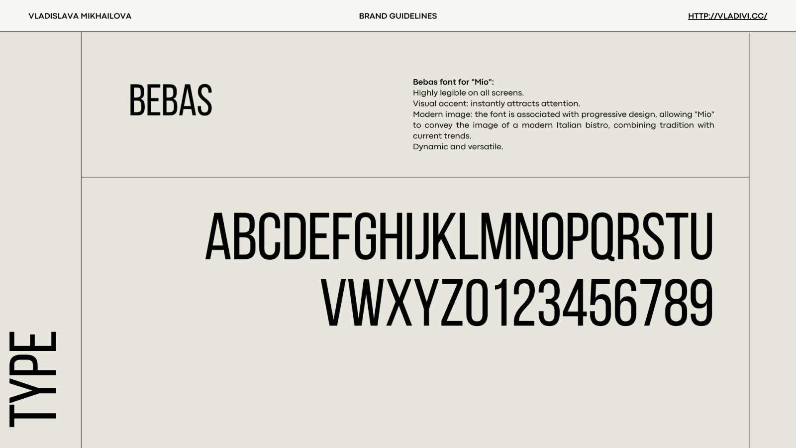
- Bebas for display — legible on all screens, instantly attention-grabbing, modern bistro image
- Documented, not implied — RGB/HEX values and usage rules the team can follow
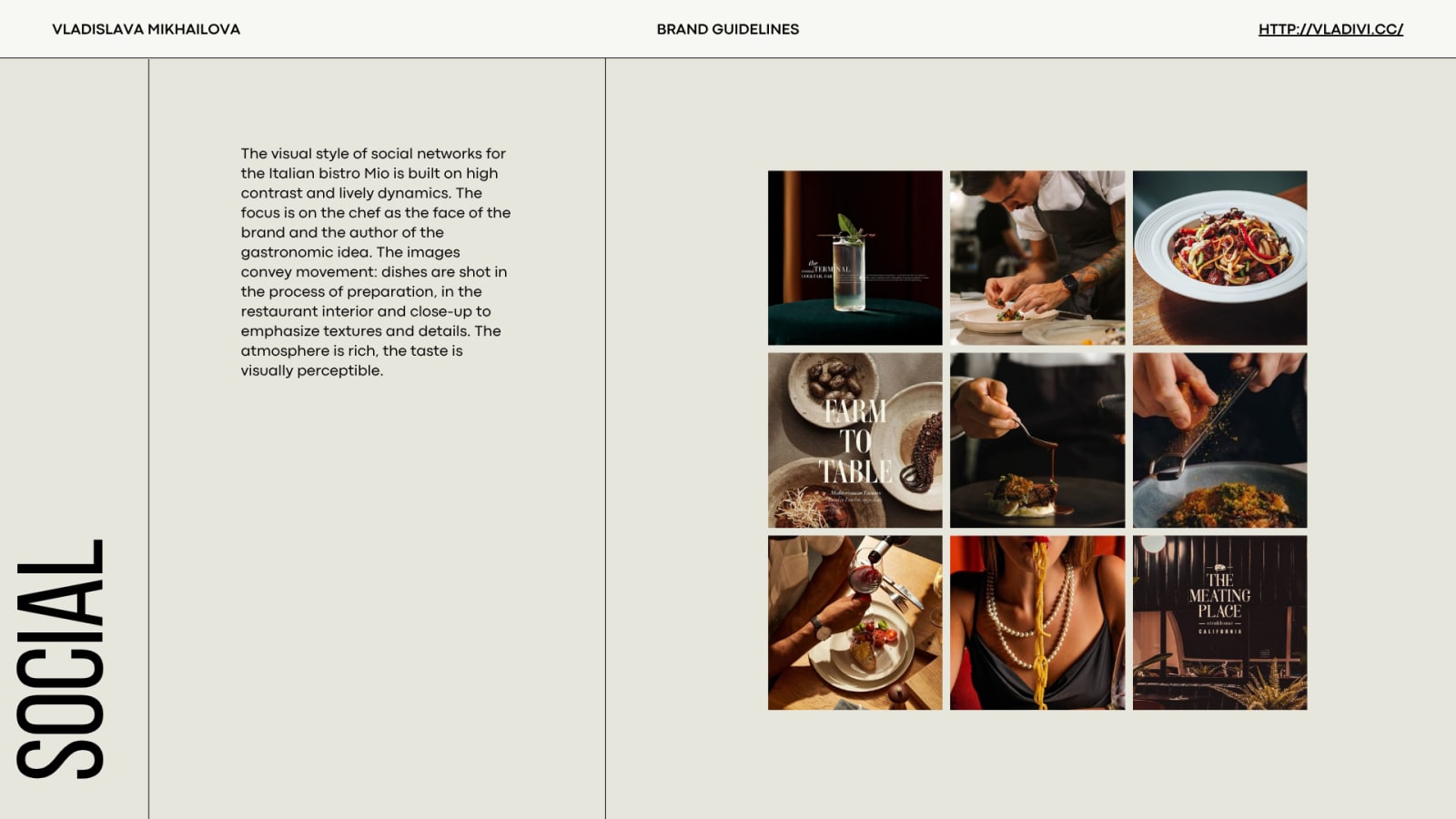
The chef as the face, movement as the language
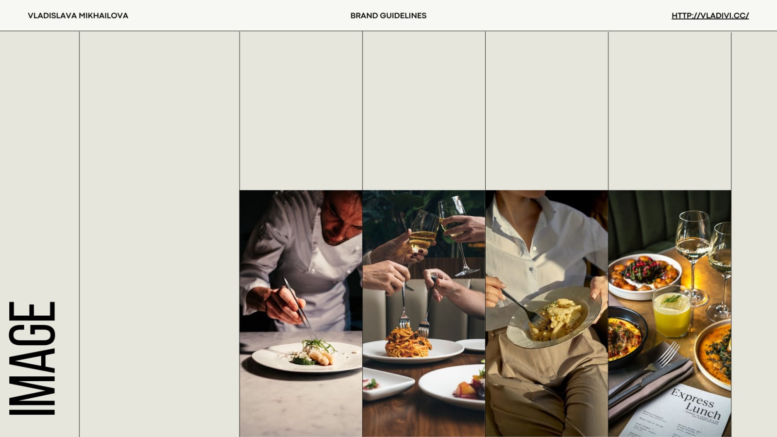
The social system puts the chef — the author of the gastronomic idea — at the center, with high contrast and live dynamics: dishes shot in preparation, in the interior, in close-up. The atmosphere is rich; the taste is visually perceptible.
A working business got a brand it can operate
Mone received a complete, documented identity system for its new life as Mio: three argued directions, a chosen visual language, palette and type with usage rules, and a social/image system built for weekly production. The transformation is operable — not a deck that dies after the presentation.
"A rebrand of a live business is a transplant, not a painting — the system has to keep working while it changes."
Client specifics and post-launch details are shared in conversation — the system and its rationale are shown in full above.
Why it was built this way
Three complete directions instead of one
ReasonFor an operating business the identity is a positioning decision with revenue consequences — the owner chooses the position, the designer guarantees each option works.
Every concept shown on real surfaces
ReasonA logo approved on a white slide fails on a menu. Application mockups made the choice about the restaurant, not about taste in logos.
Restrained palette, loud photography
ReasonIn hospitality, appetite sells. The identity frames the food instead of competing with it.
Chef-centered social system
ReasonTrust in restaurants attaches to people. The system channels that trust into a repeatable, brand-owned format.
Related: Identity Systems in the Design Archive, Creative Direction — the photography discipline behind hospitality brands.